
Concept redesign
Sumoblue: a sharper homepage for a Google Ads agency
- Client
- Sumoblue, Dublin
- Project
- Homepage concept
- Scope
- UX, visual design, front-end
- Built for
- Desktop and mobile
Great content, hard to take in
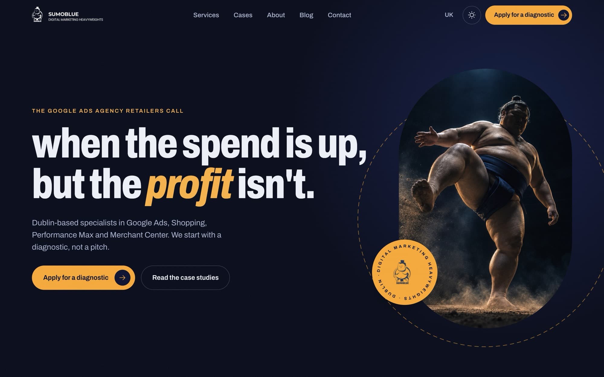
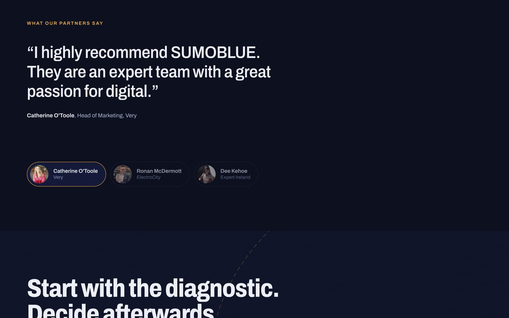
Sumoblue had everything a homepage needs: real client results, testimonials and a clear first step, a paid diagnostic. It was just hard to take in. The headline ran long, the results were hidden in screenshots and the enquiry form sat at the very bottom. We kept every word that was doing work and rebuilt the experience around it.
- Headline cut to two lines, with the call to action in view
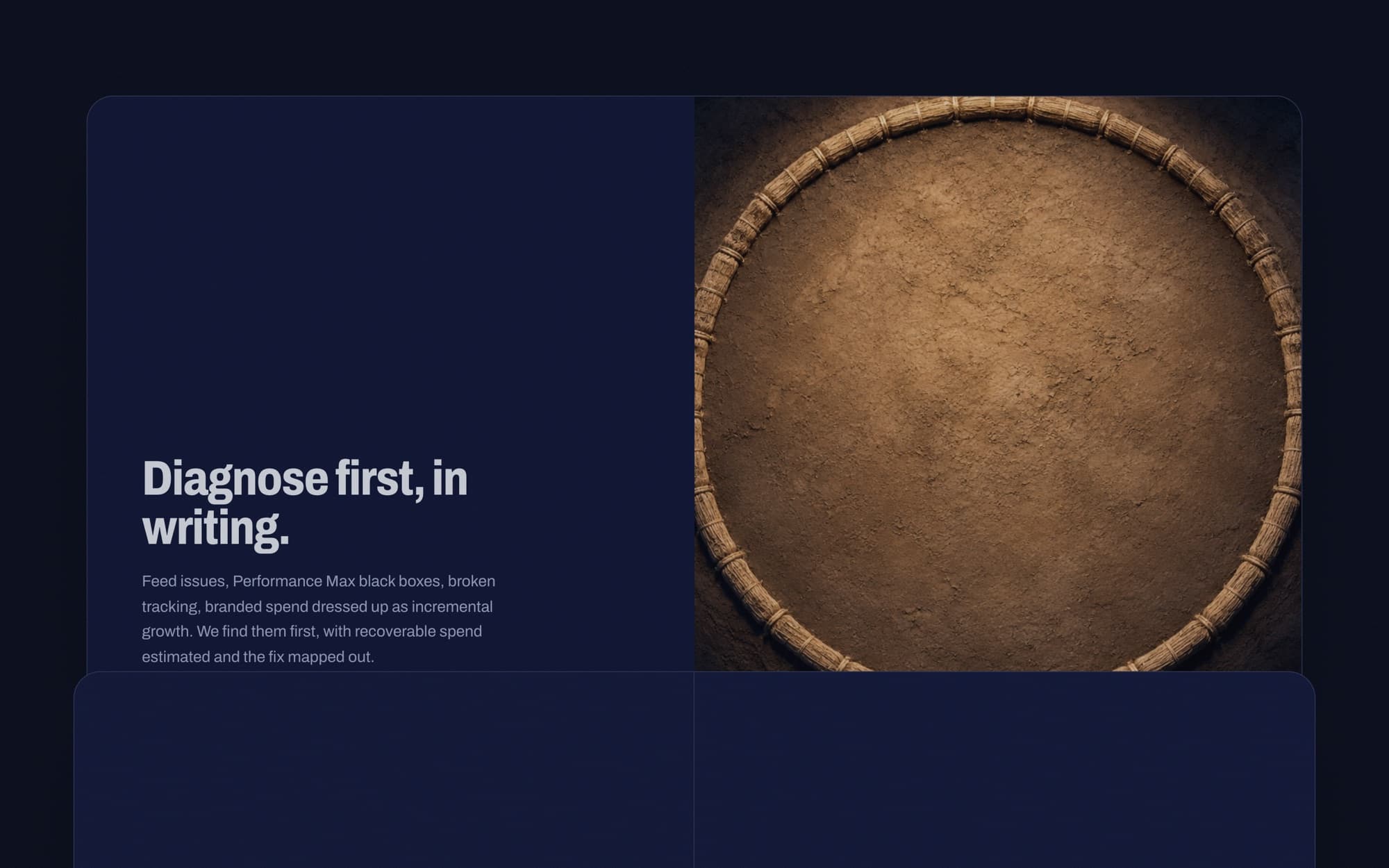
- Their brand film opens from a small ring as you scroll
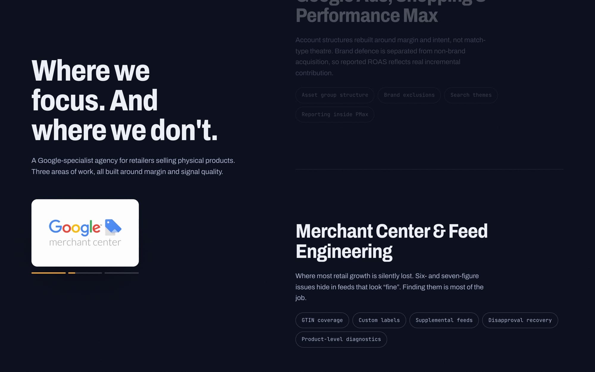
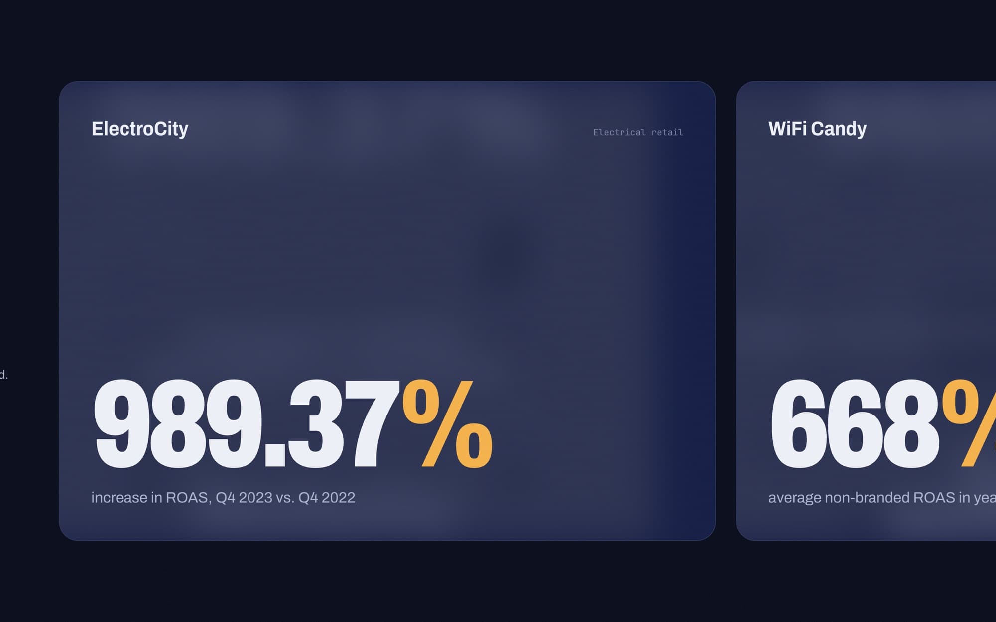
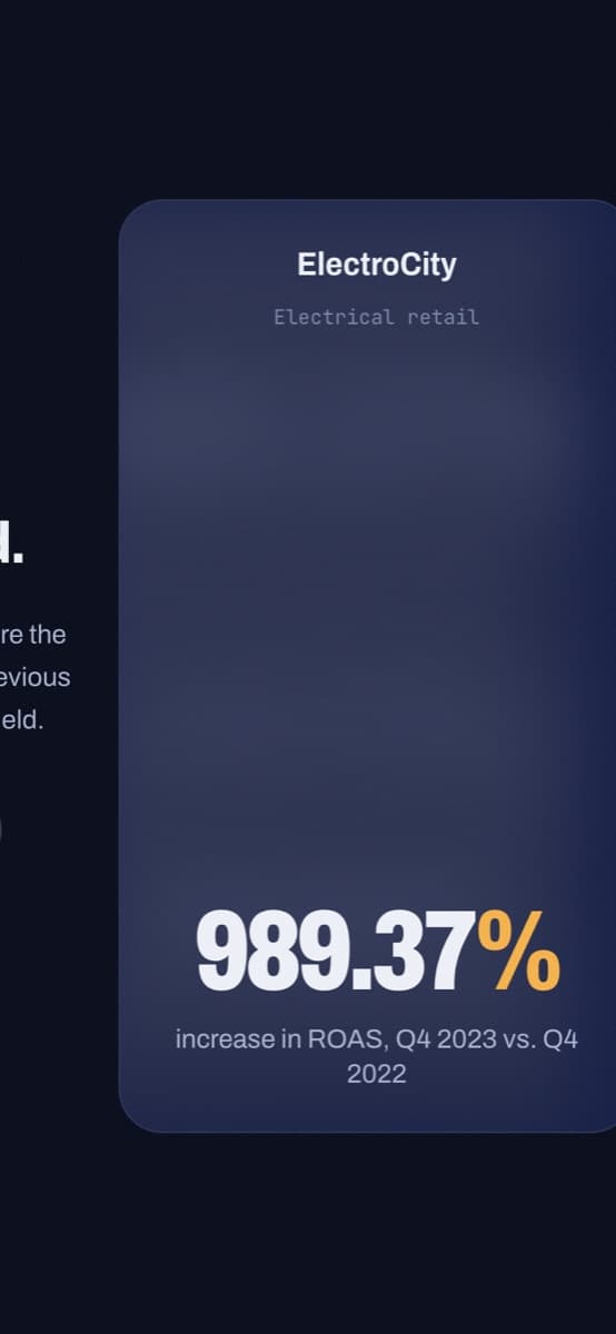
- Client results turned into big numbers you can scan
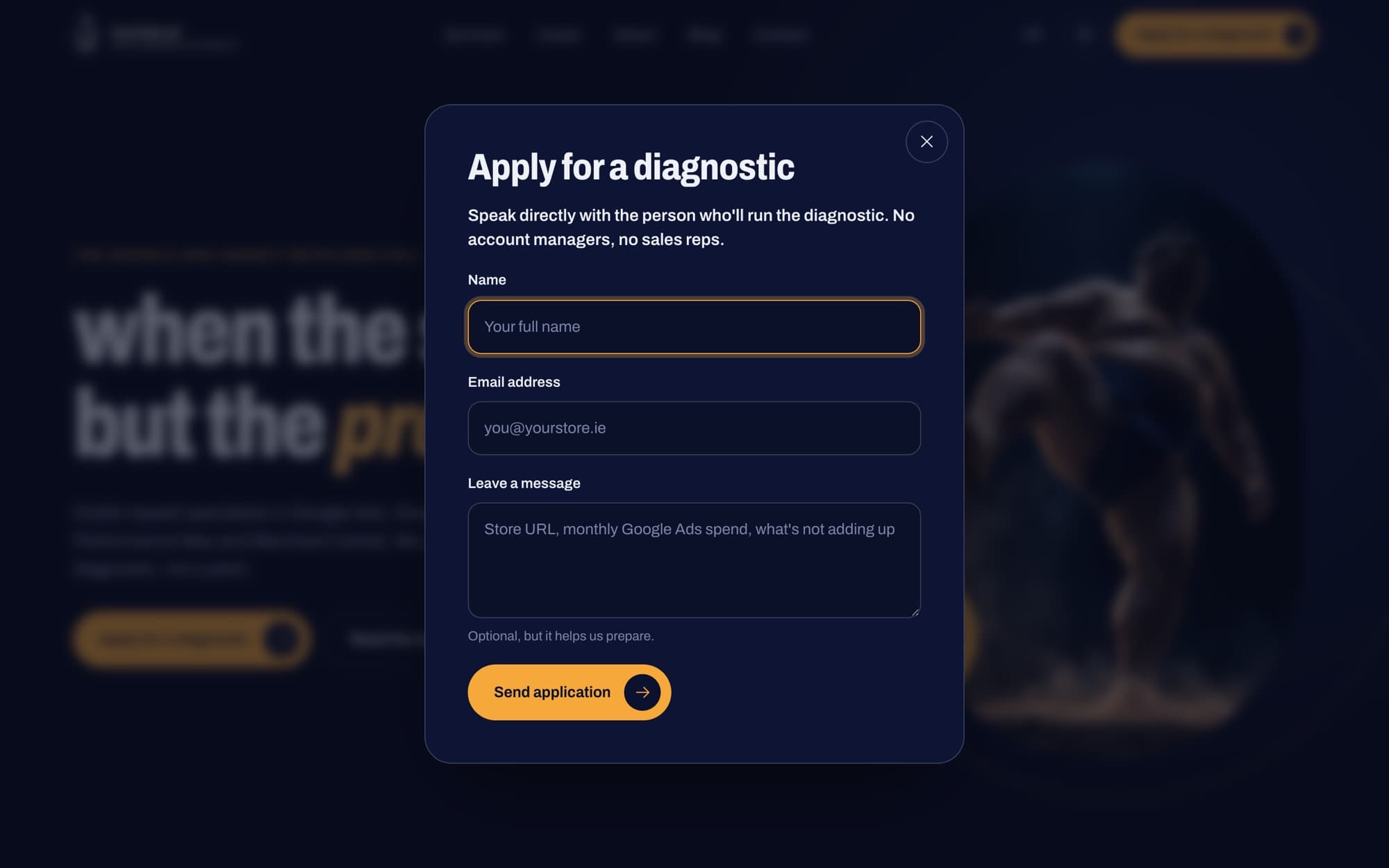
- Enquiry form one tap away, in a pop-up
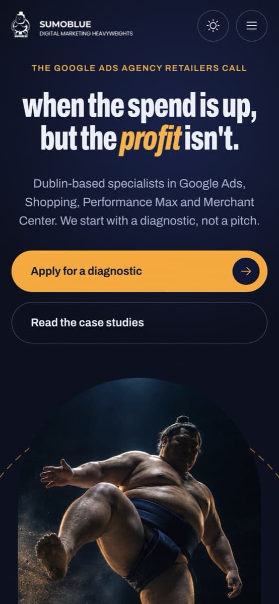
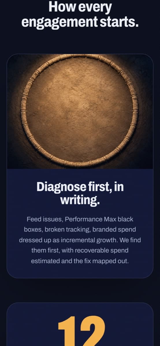
- Mobile layout rebuilt from scratch, everything centred
- Light and dark themes that follow the visitor's device
Every screen, explained

Designed for phones first
Most visitors arrive on a phone, so the mobile layout was rebuilt rather than squeezed.

Want a site like this?
Tell us about your business and we'll come back with the next steps.
An unsolicited concept made by Dublin Sites to show our approach. It wasn't commissioned by Sumoblue, and their content, film and logos belong to them.